Computing a power spectrum in Python
Edit 10 March 2021
Since originally writing this post almost two years ago, this post has attracted some attention (it seems to have been referenced in a question on StackOverflow). I have recently received a number of questions and comments on the original version of this post, which has prompted me to make some corrections and improvements to the original post. The corrections include:
- the addition of some missing imports in the example script (including replacing
import pylab as plwithimport matplotlib.pyplot as pl- an import fix and additional explanation of the bin volume factor used to normalise
Abins- a more general treatment of the image resolution, so that the example script can be applied to larger/smaller images as well
- a note on the assumption that the average amplitude is zero
- a note on the maximum value used to set up the frequency bins
The latter point was prompted by a question about checkerboard patterns (courtesy of Nicolas Robidoux, Algolux). One would naively expect that the example script would have no problem picking up a periodic pattern where pixels oscillate between two values on the smallest possible scale. And indeed, if we replace the image in the example script with a pattern like this
image = np.zeros((1000,1000))
image[::2,::2] = 1.
then the script has no problem picking up a strong peak at a frequency of 500. However, if we replace the pattern with a checkerboard that oscillates in both directions:
image = np.zeros((1000,1000))
image[::2,::2] = 1.
image[1::2,1::2] = 1.
then the script does not work, or returns different results depending on the exact image resolution (powers of two are particularly bad) or whether or not the image mean is subtracted. Nicolas suggested extending the bin range for the values to (see the note in the relevant portion of the post). However, this does not necesssarily solve the issue, since the real issue here is that the oscillations in our checkboard pattern will show up in a corner of our box in space (the intersection of the image square and the value ring), meaning they are only sampled with exactly 1 pixel. Since the power spectrum computes the variance across pixels with the same value, the power spectrum for that value will be undefined (you cannot compute a variance for a sample of size 1).
The only way to really address this issue would be to resample the checkerboard pattern so that each pixel in the original pattern is sampled by 4 pixels:
image = np.zeros((1000,1000))
image[::2,::2] = 1.
image[1::2,1::2] = 1.

image2 = np.zeros((2000, 2000))
image2[::2,::2] = image
image2[1::2,::2] = image
image2[::2,1::2] = image
image2[1::2,1::2] = image

image = image2
This correctly results in a power spectrum with a strong peak at .
A power spectrum is an analysis tool that is very often used to do a statistical analysis for a large, seemingly chaotic data set. Within astronomy, they are used in practically every field: the power spectrum of the cosmic microwave background radiation contains vital clues about the Big Bang and the history of the Universe, the power spectrum of the radio emission from galaxies can be used to characterise the distribution of interstellar gas within those galaxies, and the power spectrum of measured gas velocities in star-forming molecular clouds can be used to investigate turbulence within those clouds.
Yet, despite their widespread use, power spectra are not as easy to use as people think. First of all, there seems to be some confusion about what a power spectrum is, which I want to clear out below. Second of all, it is not as easy to compute the power spectrum for a given data set. IDL (a proprietary computing tool that is nonetheless often used in astronomy) has library functions that do it for you, but Python (a non-proprietary computing tool that is much wider used than IDL and has my personal preference) does not. In this post, I will explain how to compute a power spectrum using Python.
What is a power spectrum?
But let’s start with what a power spectrum actually is. Imagine you have an image of a set of clouds, like the one below (in grey scale for reasons that will become obvious later). The image represents a spatial map of cloud intensity: where the image is white, the cloud is strongly present, while it is less present in darker regions.

Clearly, these clouds have a very complicated, seemingly chaotic structure. They are made up of many small parts and have a fractal-like appearance: when you zoom in on a portion of the cloud near the edge, the zoomed in version of the image would look very similar to the original image.
Despite the chaos, we could still try to get some statistical information about the clouds in this image. We could for example try to determine what the typical size of a smaller cloud within the larger cloud is. To do this, we could e.g. decompose the image into different size scales. We can use some image manipulation tool to rescale the image to a very coarse version, like a 2x2 pixel image. This image will have pixels that contain the dominant colour within each large pixel in the original image. If we subtract this dominant colour from the original image, we are left with a version of the image without these largest structures. We can then repeat this procedure for increasingly more refined versions of the original image (always subtracting out the dominant components in the coarser levels), until we end up at the original image resolution. Every image in between will now contain a measurement of how strong features in the original image are at that specific resolution, and the size scale associated with that resolution tells us what the size scale of those features is.
A power spectrum is in essence a measure of the strength of the different features at the different resolutions. For each resolution, it is defined as the variance of the features on that resolution, i.e. how much total spread there is in values. A large spread means a strong signal and hence a lot of variation on this scale.
In order to do the proposed decomposition in resolutions, we require a mathematical technique called a Fourier transform. The signal on each resolution is measured by setting up a periodic function consisting of sines and cosines, with the period of these sines and cosines, called , linked to the resolution (a period corresponds to a sine wave that fits exactly once inside the frame of the image). For each value of , we get two Fourier amplitudes: the amplitudes of the corresponding sine and cosine waves that best fit the pixels in one image dimension. Since the image has two dimensions, itself has two components, so that we end up with four Fourier amplitudes per value of . The sine and cosine amplitudes are usually combined into a single complex number for convenience.
In principle, this Fourier decomposition can be done for an infinite number of values. In practice, there is however a clear limit: when the period of the sine waves is equal to the number of pixels in one dimension, then each oscillation of the sine wave exactly covers one pixel. If we where to increase the resolution even more, then multiple sine waves would cover a single pixel, and the resulting amplitude would no longer change by increasing the resolution even more. The maximum frequency that is useful in an image is hence , with the number of pixels in the image. In practice, this means we need exactly the same number of complex pixels in Fourier space to represent our image, as there are pixels in the original image.
For a multi-dimensional Fourier decomposition, there are many combinations of that represent the same resolution . However, they all encode the same information, so that we usually bin these together. The appropriate measure for the power for a specific value is than the average power within the corresponding bin, multiplied with the volume of that bin in space. For a two dimensional Fourier decomposition, this bin volume increases linearly with , in three dimensions it even increases as .
Note that a Fourier decomposition is not the only possible way of decomposing a data set. Other spatial decompositions are possible, and the power spectrum for those can also be called the power spectrum. When the data set is taken on the surface of the sphere (e.g. the cosmic microwave background data that is measured on the celestial sphere), then a decomposition in terms of spherical harmonics is used. Again, it is possible to calculate a power in spherical harmonics space that links to a specific angular scale, and the corresponding curve of power versus angular scale is also called the power spectrum. Hence the confusion I mentioned before.
Calculating the power spectrum in Python
In order to calculate the power spectrum for a data set, we have to do the following:
- Convert the data set into a suitable data array with the correct spatial layout.
- Take the Fourier transform of the data array in the number of dimensions of the data array.
- Construct a corresponding array of wave vectors with the same layout as the Fourier amplitudes.
- Bin the amplitudes of the Fourier signal into bins and compute the total variance within each bin.
Below, I will illustrate these steps for the cloud image introduced above.
Constructing a data array
This first step depends a lot on the data set under study. For the cloud image, we want to read in the pixel data for the image. We can do this using matplotlib:
import matplotlib.image as mpimg

image = mpimg.imread("clouds.png")
This will simply create a 1000x1000 numpy.array of floating point values that represents the grey scale level of each pixel. You can visualise this list using imshow:
import matplotlib.pyplot as pl
pl.imshow(image)
pl.show()
Since this function will map the pixel values to the default colour scale, the result will look quite interesting.
Since the pixel resolution of our image will be important for the remainder of our analysis, we will store it in a dedicated variable:
npix = image.shape[0]
The analysis will only work for a square image (so we require
image.shape[0] == image.shape[1]).
If the input image was indeed a grey scale image, then
mpimg.imread()should return a 2D array. Most images will instead contain RGB or RGBA pixels, so that the resulting image shape will be(1000,1000,3)or(1000,1000,4). This does not work for the script below. There are ways to convert an RGB(A) image to a grey scale image in Python, but this can also be done with image editing software. I used GIMP to convert the example image.
Taking the Fourier transform
To take the Fourier transform of our two dimensional image data array, we will use numpy.fft. This library has a number of functions to handle one, two and multi dimensional data arrays. We will use the multi dimensional function here, as that makes it possible to generalise the technique to three dimensional data sets quite easily:
import numpy as np

fourier_image = np.fft.fftn(image)
The Fourier image array now contains the complex valued amplitudes of all the Fourier components. We are only interested in the size of these amplitudes. We will further assume that the average amplitude is zero, so that we only require the square of the amplitudes to compute the variances. We can get these values like this
fourier_amplitudes = np.abs(fourier_image)**2
The assumption that the average amplitude should be zero is not actually required, as the average will only contribute to the zero frequency term of the Fourier transform (the average acts as a constant term in the Fourier expansion). This zero frequency term is sampled by exactly one wave vector, so that the variance of the Fourier amplitude for this term is undefined anyway, and does not show up in the power spectrum.
Constructing a wave vector array
To bin the results found above in space, we need to know what the layout of the return value of numpy.fft.fftn is: what is the wave vector corresponding to an element with indices i and j in the return array? If we were to make things complicated for ourselves, we could try to figure this out from the online documentation.
Alternatively, we could not worry about this, and just use the utility function provided by numpy:
kfreq = np.fft.fftfreq(npix) * npix
This will automatically return a one dimensional array containing the wave vectors for the numpy.fft.fftn call, in the correct order. By default, the wave vectors are given as a fraction of 1, by multiplying with the total number of pixels, we convert them to a pixel frequency. To convert this to a two dimensional array matching the layout of the two dimensional Fourier image, we can use numpy.meshgrid:
kfreq2D = np.meshgrid(kfreq, kfreq)
Finally, we are not really interested in the actual wave vectors, but rather in their norm:
knrm = np.sqrt(kfreq2D[0]**2 + kfreq2D[1]**2)
For what follows, we no longer need the wave vector norms or Fourier image to be laid out as a two dimensional array, so we will flatten them:
knrm = knrm.flatten()
fourier_amplitudes = fourier_amplitudes.flatten()
Creating the power spectrum
To bin the amplitudes in space, we need to set up wave number bins. We will create integer value bins, as is common:
kbins = np.arange(0.5, npix//2+1, 1.)
Note that the maximum wave number will equal half the pixel size of the image. This is because half of the Fourier frequencies can be mapped back to negative wave numbers that have the same norm as their positive counterpart.
Technically speaking, the maximum possible value in 2D is , where is the number of pixels. This is because the value for both and is limited to , so that the square root of their quadratic sum can reach larger values. Including wave vectors with however poses a sampling problem: since the circle with radius does no longer fit entirely inside the image frame, we will be missing an increasing fraction of the ring, which leads to a noticeable drop in the power spectrum past . This also means that we can only correctly sample the power spectrum up to . Features with frequencies larger than this will not appear in the power spectrum or will have significant statistical biases.
The kbin array will contain the start and end points of all bins; the corresponding values are the midpoints of these bins:
kvals = 0.5 * (kbins[1:] + kbins[:-1])
To compute the average Fourier amplitude (squared) in each bin, we can use scipy.stats:
import scipy.stats as stats

Abins, _, _ = stats.binned_statistic(knrm, fourier_amplitudes,
                                     statistic = "mean",
                                     bins = kbins)
Remember that we want the total variance within each bin. Right now, we only have the average power. To get the total power, we need to multiply with the volume in each bin (in 2D, this volume is actually a surface area):
Abins *= np.pi * (kbins[1:]**2 - kbins[:-1]**2)
We compute the surface area as the difference between the surface area of two discs with respective radii and , which are the values at the lower and the upper edge of the bin. This is a more accurate version of the commonly used surface element , since this latter formula is technically only valid for infinitesimally small .
In the original version of this post, I accidentally used the 3D surface element , leading to the expression
Abins *= 4. * np.pi / 3. * (kbins[1:]**3 - kbins[:-1]**3). As a result, the power spectrum shown in my original post was wrong.
Finally, we can plot the resulting power spectrum as a function of wave number, (typically plotted on a double logarithmic scale):
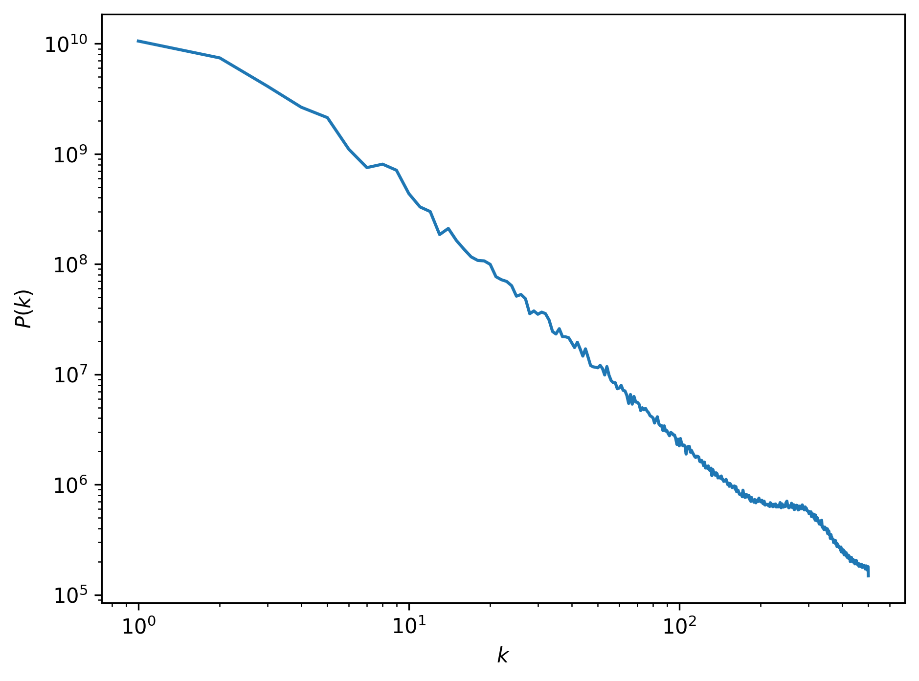
This power spectrum has some interesting features. First of all, we can see that most of the power is located at large scales (small wave numbers). This makes sense, as the image is dominated by the large cloud structures. Towards smaller scales (larger wave numbers), the power drops of almost linearly. This is an expression of the fractal nature of the cloud: at lower resolutions the same types of patterns return, but at increasingly lower signal. There is a huge spike in the power spectrum at a wave number of , or a size scale of about 3 pixels. This is the scale at which the smallest cloud features at the edges of the clouds manifest.
Putting it all together
Below is the full script to plot the power spectrum for the cloud image. I hope the part that calculates the power spectrum might be useful for other applications. An extension to higher dimensions is straightforward; simply replace the knrm calculation with a higher order equivalent.
import matplotlib.image as mpimg
import numpy as np
import scipy.stats as stats
import matplotlib.pyplot as pl

image = mpimg.imread("clouds.png")

npix = image.shape[0]

fourier_image = np.fft.fftn(image)
fourier_amplitudes = np.abs(fourier_image)**2

kfreq = np.fft.fftfreq(npix) * npix
kfreq2D = np.meshgrid(kfreq, kfreq)
knrm = np.sqrt(kfreq2D[0]**2 + kfreq2D[1]**2)

knrm = knrm.flatten()
fourier_amplitudes = fourier_amplitudes.flatten()

kbins = np.arange(0.5, npix//2+1, 1.)
kvals = 0.5 * (kbins[1:] + kbins[:-1])
Abins, _, _ = stats.binned_statistic(knrm, fourier_amplitudes,
                                     statistic = "mean",
                                     bins = kbins)
Abins *= np.pi * (kbins[1:]**2 - kbins[:-1]**2)

pl.loglog(kvals, Abins)
pl.xlabel("$k$")
pl.ylabel("$P(k)$")
pl.tight_layout()
pl.savefig("cloud_power_spectrum.png", dpi = 300, bbox_inches = "tight")
Professional astronomer.